Sunday, 26 July 2009
Noho loft
Gary Chang’s Apartment
Tuesday, 16 June 2009
The Cascade House by Paul Raff Studio


Oriented on a strict Cartesian axis, the house is designed to maximize its potential for natural light. The integrated design combines a high-performance building envelope with passive solar design systems as an effective environmentally-responsible strategy for its northern context. A two-storey tall expansive window along the buildings south facing elevation allows the low winter sun to penetrate and warm the house. An internal triple height slate wall captures available solar energy and keeps the house warm during evening hours. Smaller apertures within the wall dapple adjacent rooms with light while its resonance within the house frames views and anchors internal circulation.
Along the street façade is a prominent glass privacy screen made from 475 panels of 19mm vertically stacked glass. Set in a crenellated pattern, this sculptural screen allows a maximum diffusion of light while providing visual privacy from the street. The screen also becomes a striking element when viewed from the street. Even on the greyest days of the year, its subtle shifts in colour and texture imbues the street with vitality. When viewed from the interior, the ethereal light quality evokes being caught up in the crest of a wave or being suspended behind the cascade of a waterfall. At its opposite end, the room opens out to a generous terrace and pool, extending the interplay of light and water in a continuous flow between interior and exterior space
Casa Tropical by Camarim Architects


Mundaú is a fishermen’s village in an immense beach in the state of Ceará, in Northeast Brazil. 3º 10′ 42.51” South of the Equator, years are split in wet and dry seasons, with temperatures ranging from 22ºc to 33ºc. Heavy rainfall from January to July ensures a fertile ground where vegetation flourishes until December.
The clients wanted a holiday house with 3 bedrooms that allowed wide possibilities of contact with nature. We have replaced the conventional solution in domestic architecture - a compact volume with internal circulation - with a gallery that surrounds the 3 floors of the house, and corresponds to 50% of the total area. Both the wooden skin that envelops the gallery and the suspended roof, shelter the house from the Sun while keeping it permeable to the cool South wind, avoiding the need of air-conditioning.
We thought of systems in which earth, Sun and shadow, coconut trees and other trees, dunes and sea, would complement the design of the house, suggesting a condensed and sensual experience of close and faraway nature.
3 Floors: 3 Landscapes totally diverse in use and means of approaching nature. 1: the podium, at street level, looks over the garden. Two volumes sheltering ancillary functions leave an open space for permanence, with wide views over the garden, under the shadow of the house above. 2: the rooms are accessed via the gallery, which is wrapped in a wooden skin that negotiates privacy, views, ventilation and shadow, this last one treated as a living ornament. The walls have the roughness of hand crafted bricks, painted ice white. 3: the living room is a house on the trees, a wooden house on top of the concrete house. The open roof leaves space for 3,20 m high glass panels, merging coconut trees, dunes and sea in the open plan interior.
Another house was here before, a weak construction, though with a rational structure. The new house developed around this skeleton, which was reinforced to hold the wooden house on top. The difficult access to Mundaú took us beyond architecture: we designed everything from structure to services, from sliding doors with guillotine system to beds and chandeliers, we were ourselves the building contractors, completing the 490 sqm construction in 7 months. Apart specialized works such as glass and kitchen installations, the construction was carried by local masons and carpenters, with several generations of experience in native materials and techniques, and with few mechanical equipment: it is a building done with the hands. The stacking of autonomous structures, the inverted roof in cantilever, the size of the glass panels, are all new features in the region.
Landscape design consisted of elemental interventions that transformed an agricultural land in a tropical garden. We selected trees and cleaned the ground, leaving the sand on the surface. The parallel irrigation canals, which divided the land, were redesigned as long diagonals across the garden. We modelled the site and laid granite stones from the house to special areas in the garden: a table under a passion fruit pergola, a street access under the generous shadow of an old cashew tree, a lush green hideaway. For the wall, we produced precast perforated concrete panels that draw textures of light and shadow from the nearby foliage, and allow for a diaphanous, circumscribed glance of the garden. The wind that passes through the wall shakes the water and the leaves, generating a cool microclimate during the dry season.
Passive cooling is achieved by means of the gallery: it shelters the interior spaces from the tropical sun, leaving them permeable to the mountain breeze. The wooden skin that wraps the gallery filters glare, protects intimacy in the bedrooms and frames sights. Drinkable water is obtained from the roof, the deep stream or transported by truck; it is then filtered, stored and pressurized to the tap. Energy is generated from sun and wind, intense in the region, or bought from the public network. Hydraulic, electrical, gas and telecom services run in 2 vertical cores accessible from the 5 bathrooms and 2 kitchens for maintenance. In the absence of a public sewage system, we designed a sceptic tank with a super efficient anaerobic filter that cleans up to 90% of the effluent. The energy and service strategy of this house is unprecedented in the region.
Project Architects: Vasco Correia & Patricia Sousa
Sunday, 14 June 2009
Putney Mountain Residence by Kyu Sung Woo Architects


Otake House by Suppose Design Office


The Otake house is located in the West of Hiroshima prefecture, on a high plateau that neighbors the Kamei Park of the Kamei Castle Ruins. To the South is an industrial region and a beautiful mountain range, and to the North a remarkable view of the Seto Inland Sea and Miyajima. We created a design fitting to these two contrasting and beautiful scenes.
We thought of the North side as the type of scenery you take in and savor, and the South side as the type that you place yourself in. Structurally we divided the area between load bearing zones and free zones to make a place that could have two personalities at once.
The North side is open even while closed, with the bedrooms, kitchen, dining area, and wide apertures to view the distant scenery, which at the same time are functional as load bearing parts of the structure. We wanted the South side to be as close as possible to being outside, so we got rid of some structural elements and designed a living area and terrace with a 6 meter eave, treating the terrace and living area as equal to create a free space with no division between inside and out.
Though there were setbacks after considering the structure necessary to support such a large eave, as well as legal safety standards, the building began to take shape. By covering the entire building with water proof material used in ship construction we made a unique and detailed building that doesn’t require sealants or tiling. Furthermore, because the glossy, water proof material wraps around the building inside and out uninterrupted, a nature-like space is created where you can take in the outside scenery and the building and surroundings seem to blend together,
By considering views about execution from the planning stage on, we discovered water proof materials previously unknown to us. In much the same way that an object will look different when seen from different angles, by looking at one project from the different view points of planning, structure, and execution we think we were able to move in a better direction.
Monday, 25 May 2009
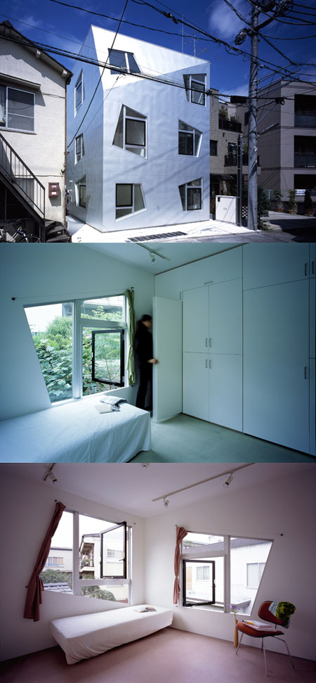
LOFT APARTMENT Fudomae apartment's design
LOFT APARTMENT The Fudomae apartment's design makes the most of a limited volume while creating a comfortable urban living space . Each 18 sqm unit fits a living room, kitchen, bathroom and storage. The tight arrangement is transformed into a design expression, particularly through the location and shape of the window, which designates the placement of the bed and other furniture. The window's angle and height corresponds to both the interior of the room and the scenery outside, linking the Japanese single lifestyle and the natural environment.
Maff Apartment - Modern Apartment Design by Queeste Architecten
Here is the modern apartment design by Queeste Architecten in the Hague, the Netherlands. The concept of this design is how to make the comfortable living environment in small space with luxurious and contemporary style. This Apartment was called “Maff Apartment”. at this pictures you can see the bedroom, living area, kitchen and bathroom interior. Clean and minimalist design in white, black and orange combination. Really nice and inspiring.
Monday, 18 May 2009
“Lost House” Modern Apartment with Minimalist Interior
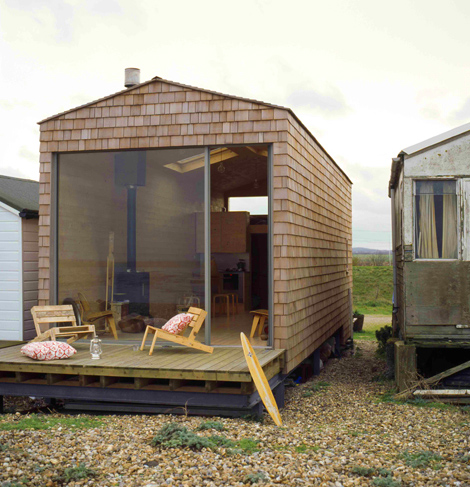
Small Beach Cottage - compact waterfront cottage design that is coziest ever!
Monaco House by McBride Charles Ryan, 2008 | Melbourne
Modern Rooftop Loft at Five Franklin Place in New York
This Rooftop Loft design by celebrated Dutch architect Ben van Berkel of UNStudio is futuristic, functional art at its finest. Five Franklin Place in New York City’s TriBeCa neighborhood enjoys modern and historic influences, all wrapped in an artful facade. Says van Berkel, “We picked up the strong horizontal cornices and decorative details of TriBeCa’s architecture, re-formed them, and transported them onto our building in a very contemporary way that makes them truly functional but that still has a lot to do with pure surface decoration.” The exterior is dressed in modern metal bands, described by the architect as “sewn on, like a dress.” The rooftop loft is a white crown atop this modern building. Inside, the double-height lofts cleverly capitalize on natural light and space. The home is flooded with daylight from the two-storey Great Room windows, and the contemporary plan puts the mezzanine at the center of the design, suspended above a 20-ft. high library/gallery space and disappearing stairway. The kitchen by B&B Italia is a sculptural and high-performance space, featuring an innovative island, custom cabinetry and fixtures, polished in every sense of the word. The master bedroom boasts a unique ensuite with a curved sliding wall that opens onto the bedroom. Living spaces feature integrated balconies what offer breathtaking views of the New York City skyline. UNStudio.
Saturday, 16 May 2009
LESS STUFF IS BETTER DESIGN
I know I've been harping about this since I first got the idea for the Two Dozen list in 2004: the Roaring Two-Thousands created a lot of drek by designers because they were "designers", not because the designs were actually great. A lot of my writing has been focused on pushing designers to do better. What better opportunity for designers to really push design when all this money is sloshing around? Why not make things more efficient, more accessible, more inventively designed, and more beautiful, even if it costs a bit more? When the cycle downturns, we'll be happy to get scraps from the woodpile to make our stuff. Since September, most of us have been looking for that scrap pile.
Michael Cannell over at The Design Vote wrote a great article in the New York Timesencapsulating these sentiments, looking quickly (as in long-blog-post quickly) at where product designers and architects are going to go from here. He champions sustainability in the production of goods and a good project by Lorcan O'Herlihy architects in Los Angeles that champions density over size of lawn. Welcome to the end of the decade, folks. We couldn't be more thrilled
The Pure
Glacier Loft
Future Hotel Room by LAVA
Architects LAVA have designed a hotel room as part of a research project in collaboration with Fraunhofer IAO(Institute for Work Organisation) in Stuttgart, Germany.
Losa Loft: Stylish and Spacious Adobe in the Heart of San Francisco
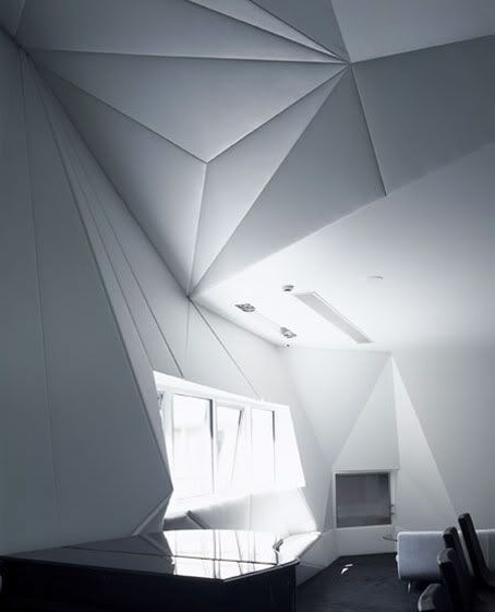
In what is a beautiful example of revamped and redecorated space, the Losa Loft in San Francisco designed by Aidlin Darling Design firm exudes beauty and simplicity. By consciously creating specific and separate architectonic elements, the home follows a modern minimalist approach for much of its interiors and furnishings. With neutral shades to accentuate its beauty and a dash of bold red to give it a more vibrant look, the loft redefines the way renovated homes are perceived. Simple, warm and with uncomplicated details, we’re definitely sold on the design.
J-Loft by Plystudio
Architecture and design practice Plystudio have completed an apartment interior called J-Loft in Singapore.The project involved removing all interior walls from the apartment and installing box-shaped divisions and furniture along one side of the 1,200 square foot space.
credit Matylda Krzykowski
Loft space in Australia
Revamped by Fiona Winzar Architects, this wonderful and tranquil-looking home has been transformed into a green hub on the request of the owners. The Eyelid Home has undergone a variety of changes so that the residents could be ensured both privacy and green features that cut their bills and keep their spending to a bare minimum. The house was flanked by a three-story hotel on one side and a three-story apartment on the other, making privacy a huge issue for the residents. The designers got past this problem by giving this structure its standout feature - the eyelid-shaped roof. This not only gives the residents much neededprivacy but also helps the regulate home’s temperature.
credit www.ecofriend.org
Hide your office space
My previous post showcased a beautiful loft space that housed a pod-like office inside the open-space apartment. Here’s another example of creating an office in a loft apartment. I’m not into the bed on top but I like that this one was created with a translucent material. I’d like to combine the design of both into one. That would work for me!